Customising your UI
Each Experience can be customised to look on-brand through settings in Studio
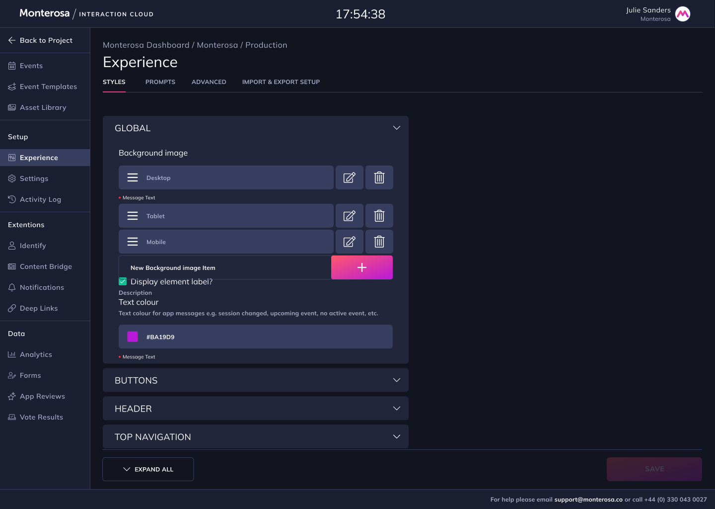
Once an Experience has been created during setup, the UI of the Experience can be customised using settings found in the Styles tab in Studio.
All style settings are applied immediately to the audience facing Experience, not requiring an application re-build each time a setting is updated and saved.
Navigate to Experience > Styles:
If you use Figma please refer to Experience Styling to use our UI Kit resource.
Global Styles
Background colour (hex, rgb or rgba)
Background image - with mobile/tablet/desktop breakpoint variants
Element Header
Element Label colour & text ("Standard Quiz")
Element Title colour & text ("Quiz Question")
Element Subtitle colour & text
Element Closed label colour, background colour, border radius & text ('Closed')
Primary buttons
For both light and dark mode variants:
Border radius and width (in px)
Default state - text, background, border and radius colour
Hover - text, background, border and radius colour
Submitted - text, background, border and radius colour
Elements
Padding - vertical & horizontal (in px or %)
Border radius (in px)
Max width of container (in px) in 5 breakpoints:
Mobile portrait
Mobile landscape
Tablet portrait
Tablet landscape
Desktop & wider
Background colour (hex, rgb or rgba)
Light theme
Dark theme
Your branded header, footer and/or navigation can be added to your Experience. Learn more about adding your branded header, footer and/or navigation ⏩